Sharing Larger Images Online
I like to share my digital images and have always realized that the experience of the viewer depends, to a large extent, on the image size. For desktop devices, I have previously restricted the maximum image size to an 800-pixel width; I let the height be whatever it needs to be to display the image. I use a simple HTML5 gallery and have coded my web site to display on multiple devices: phones, tablets, and desktops. Because the gallery is mobile friendly, the images resize automatically to fit all display sizes.
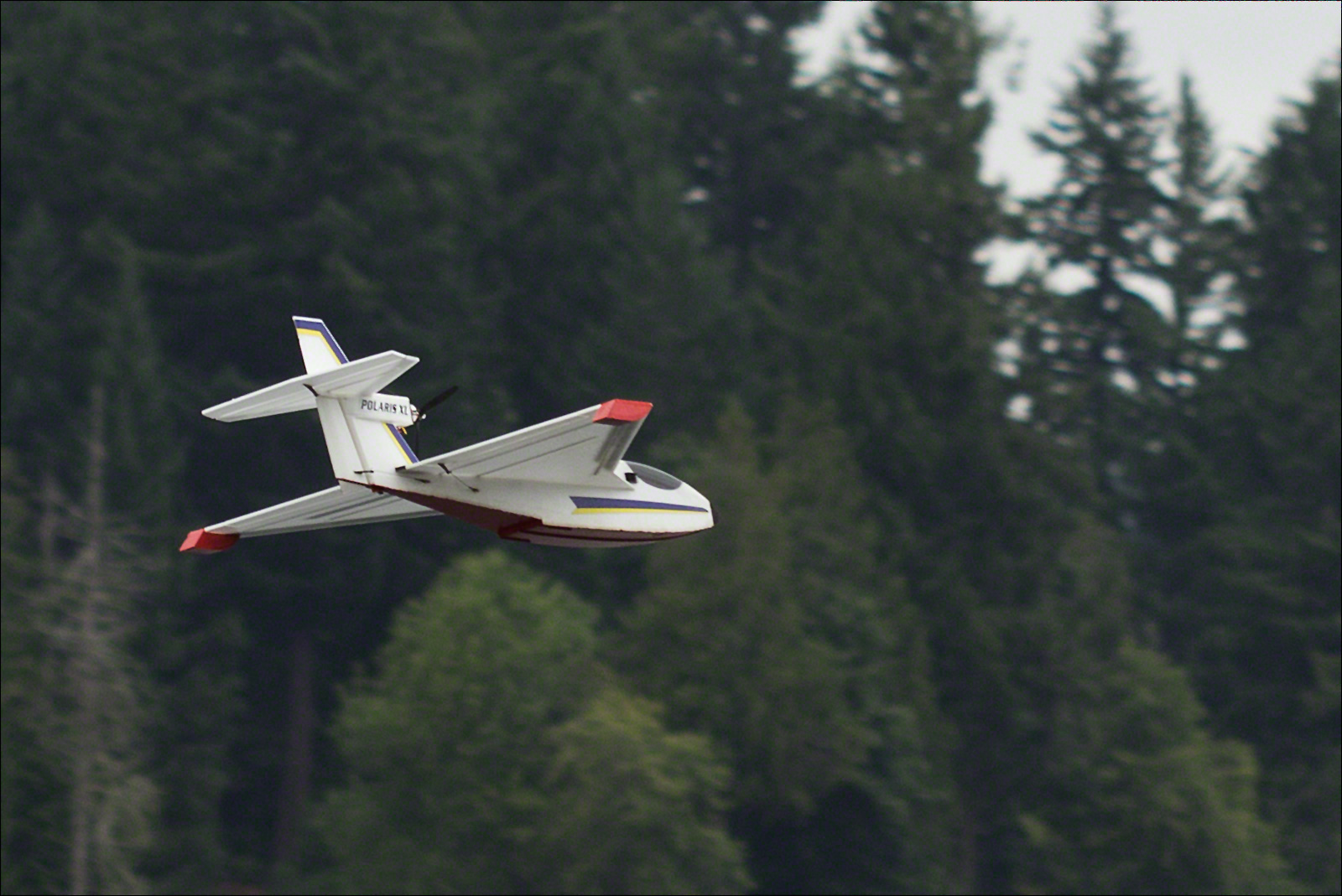
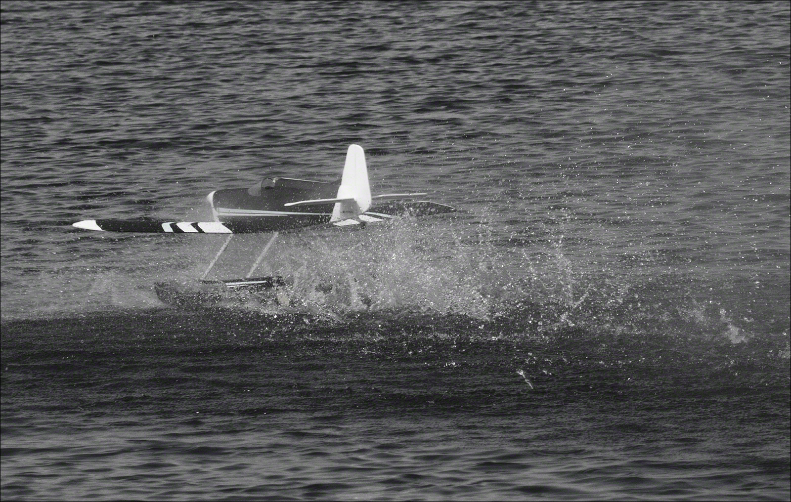
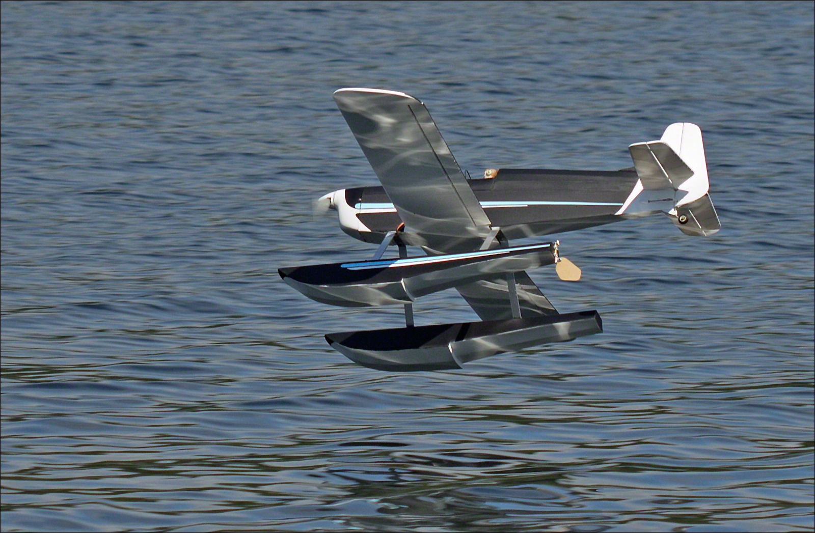
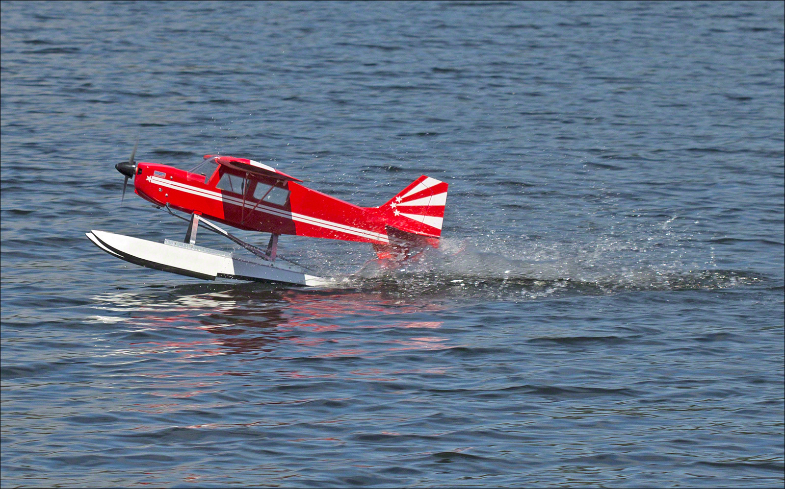
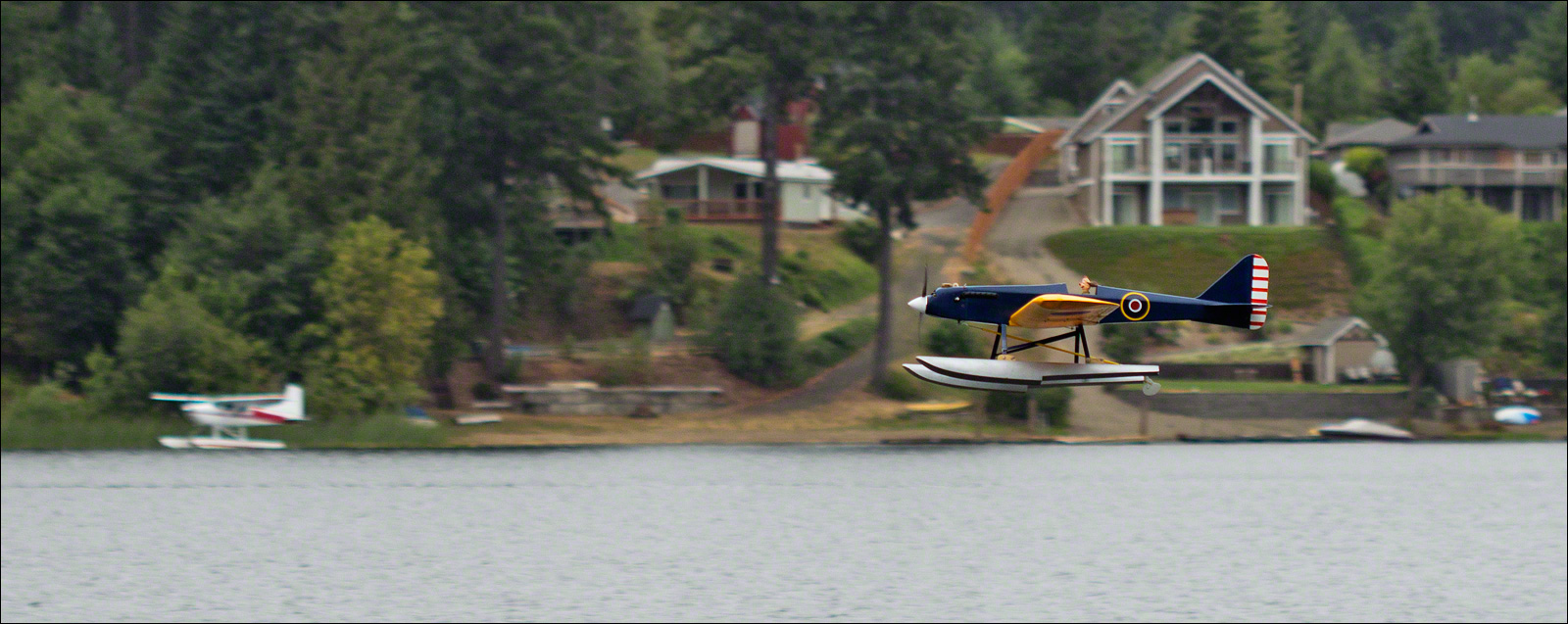
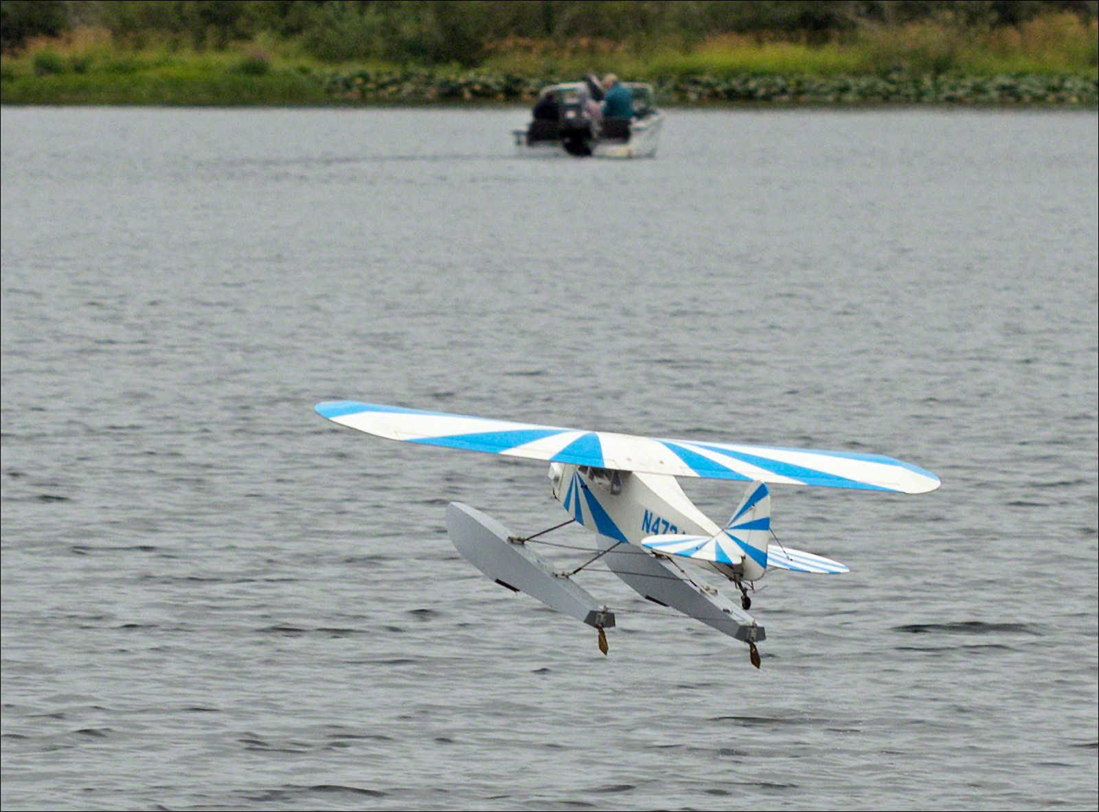
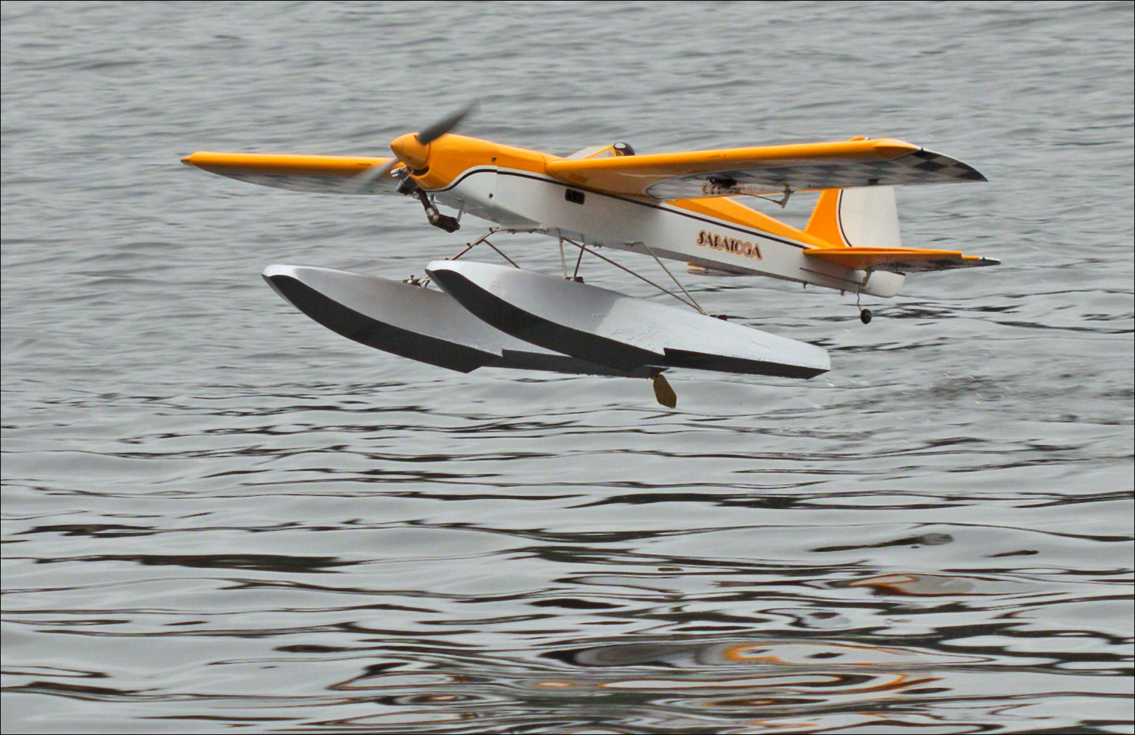
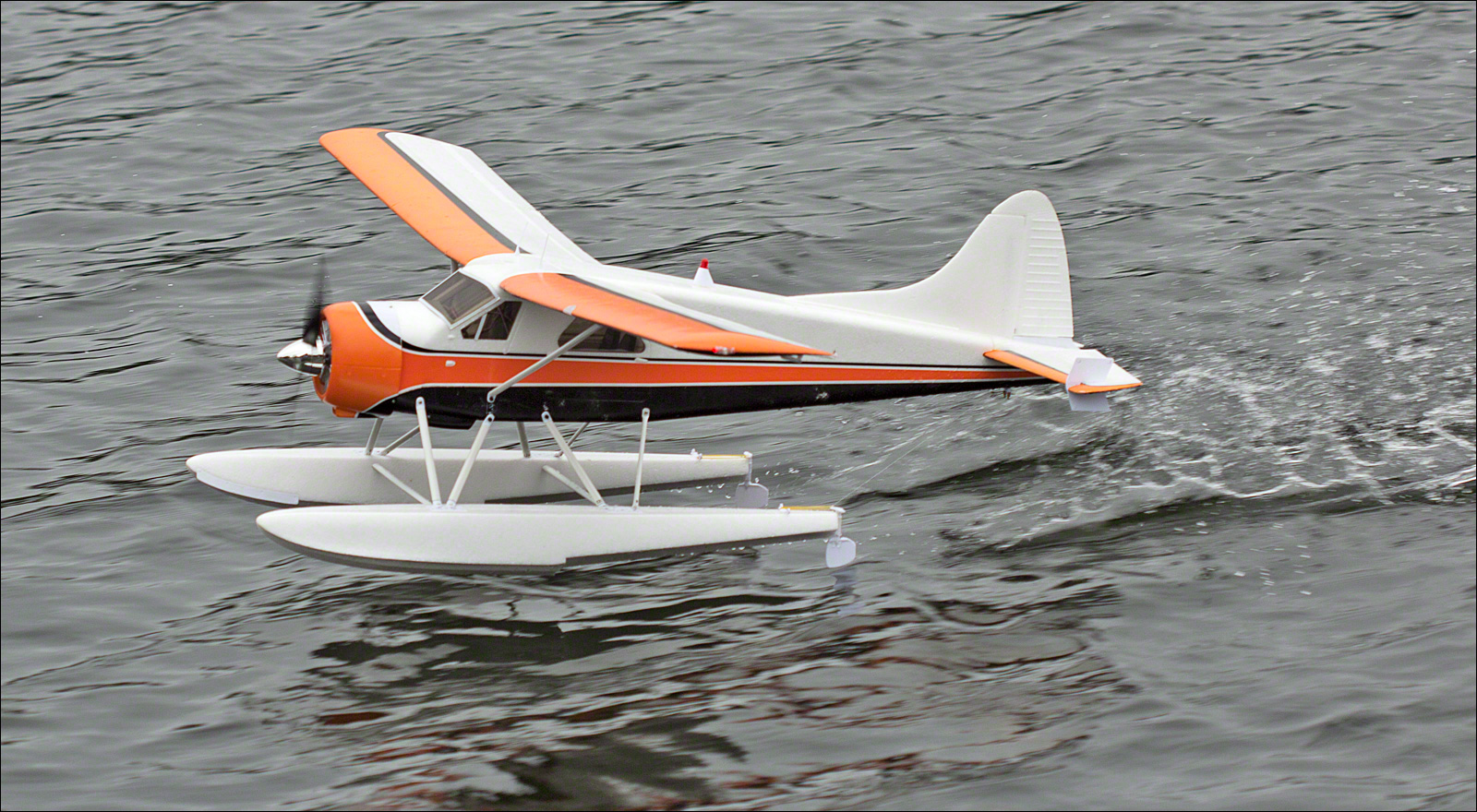
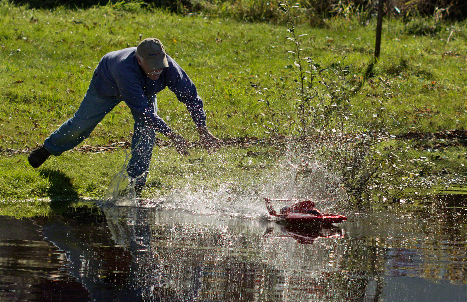
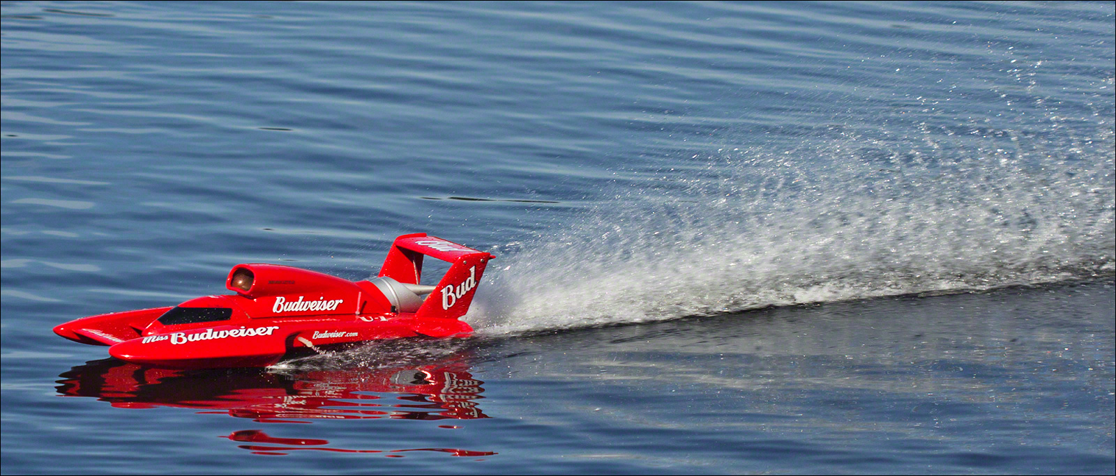
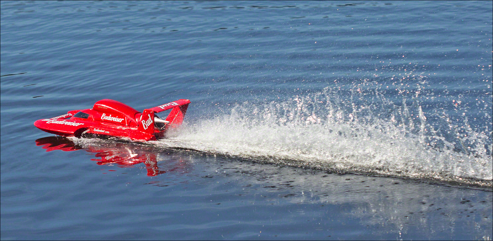
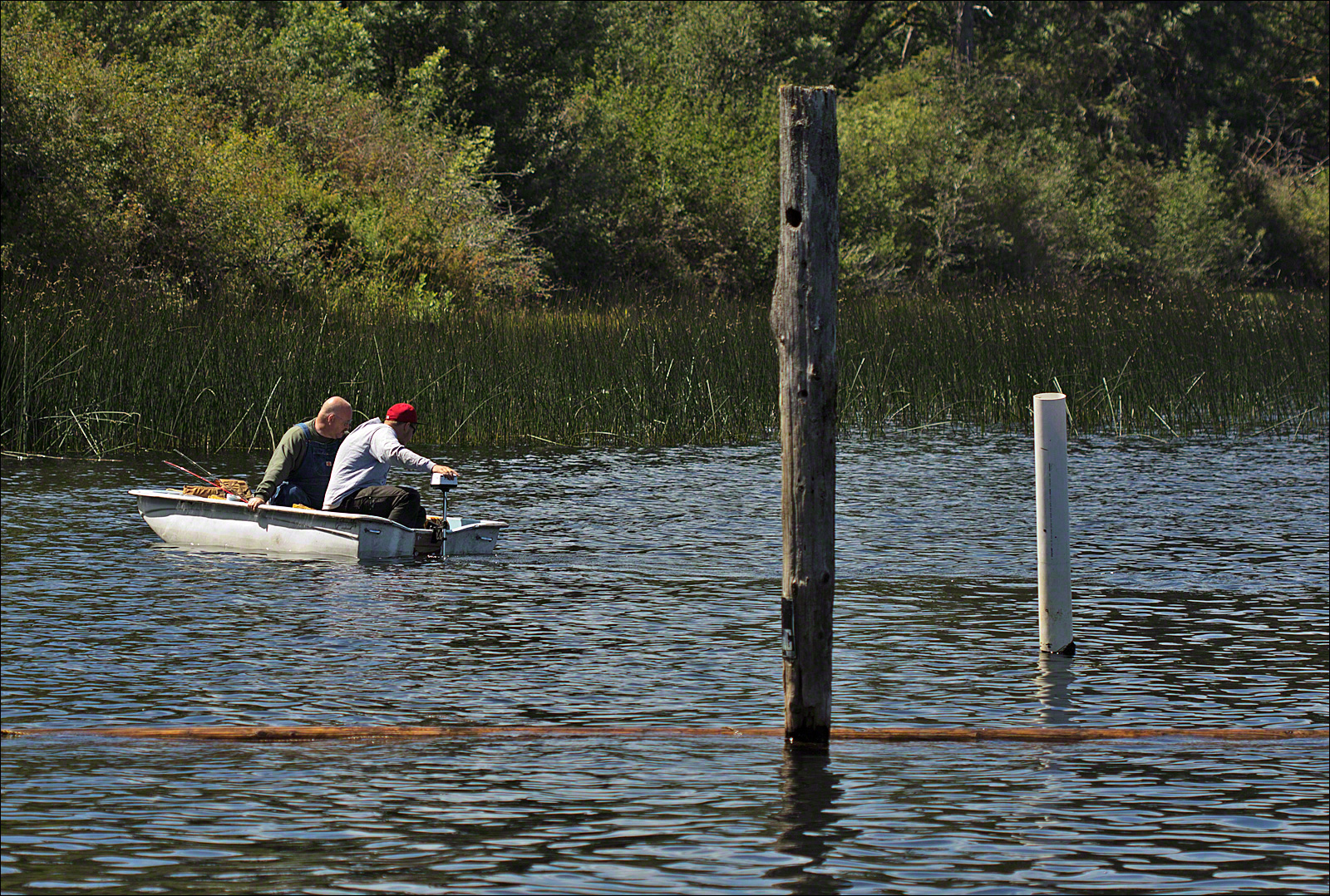
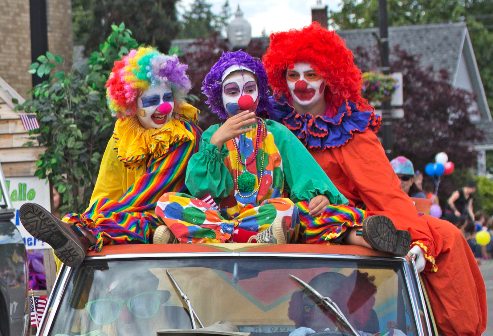
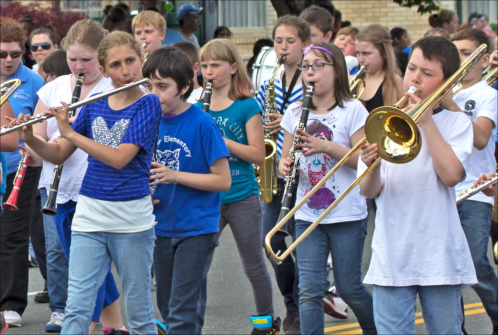
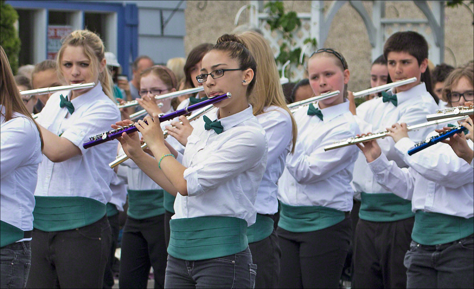
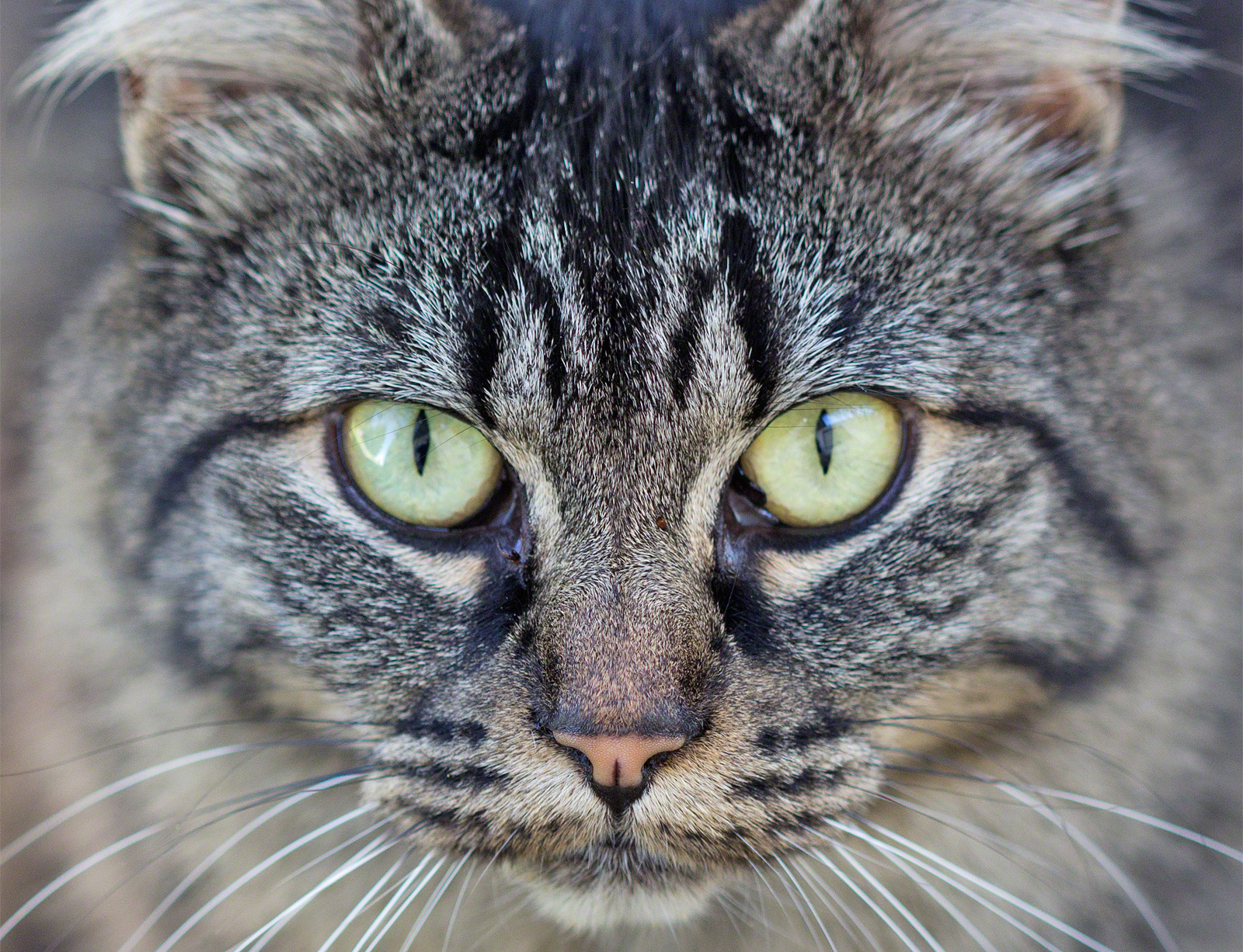
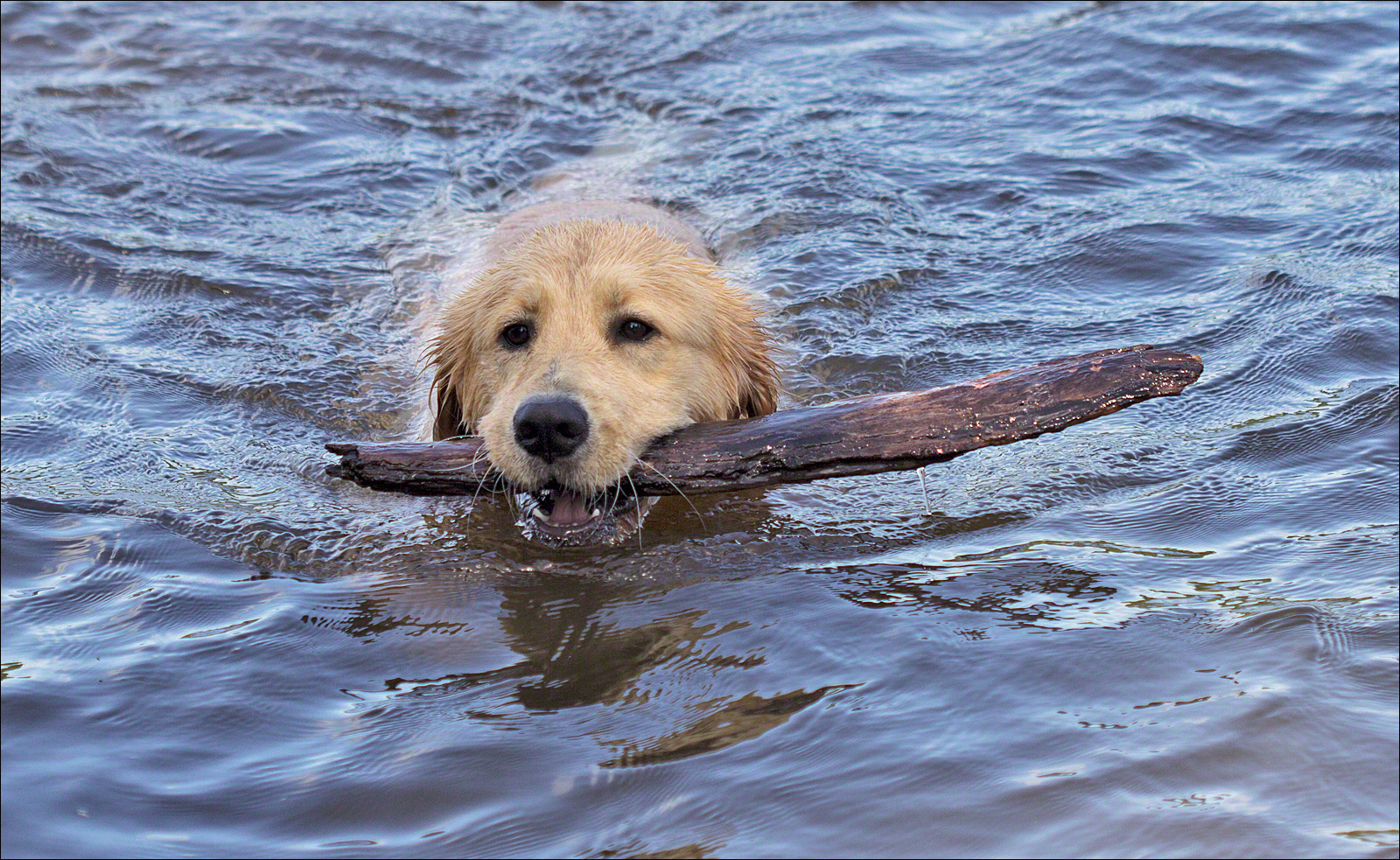
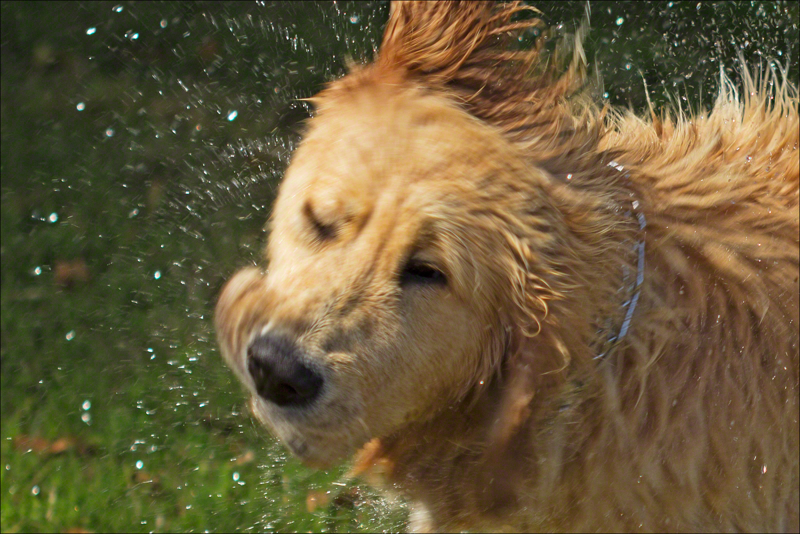
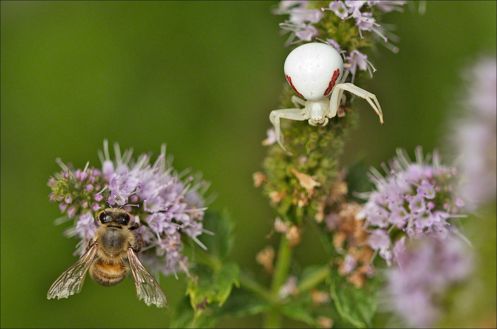
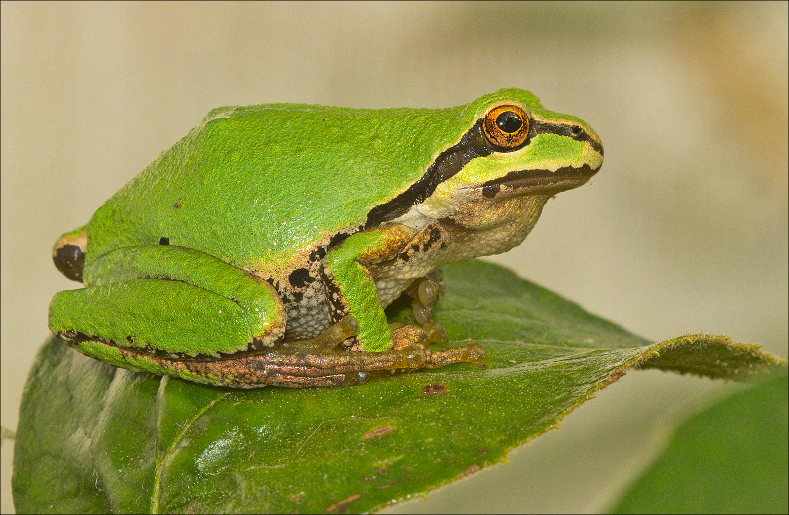
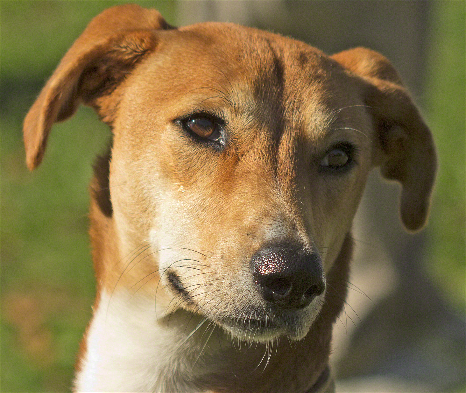
Although a width of 800 pixels gives a pretty good view of the image content, it takes a larger image to bring out the drama and show the detail I really want the viewer to experience. In this gallery of images, I have increased the image width (and therefore the image size) to 1400px. Displaying these larger images required only a line or two of CSS styling-code modification.
I hope you enjoy these images as much as I enjoyed capturing them.
Gallery
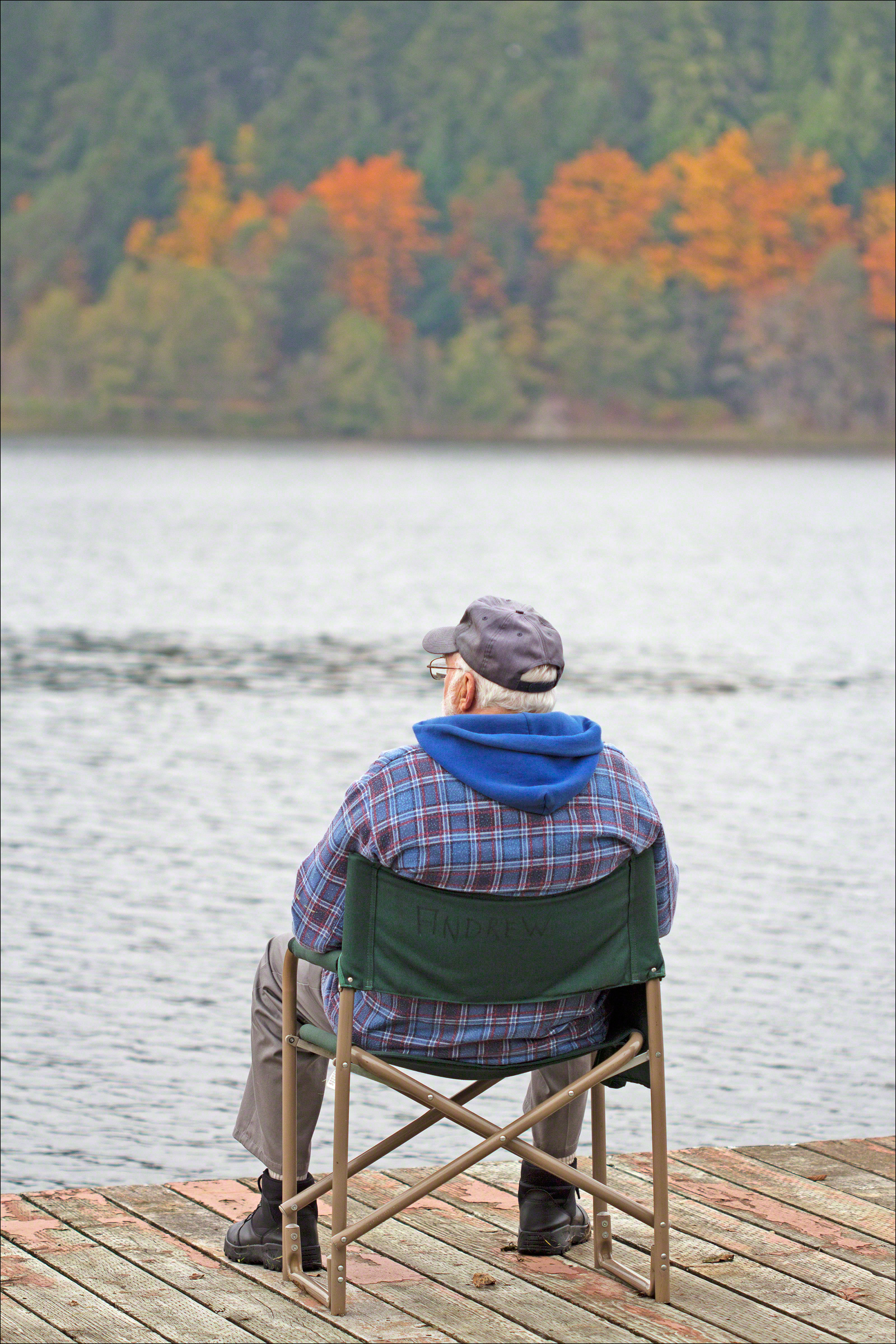
At Lake Isabella

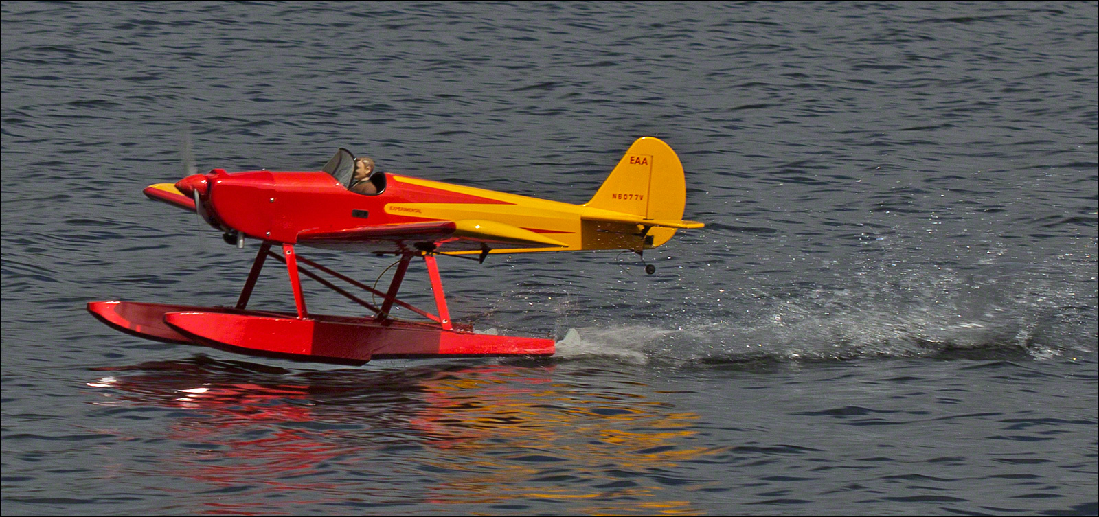
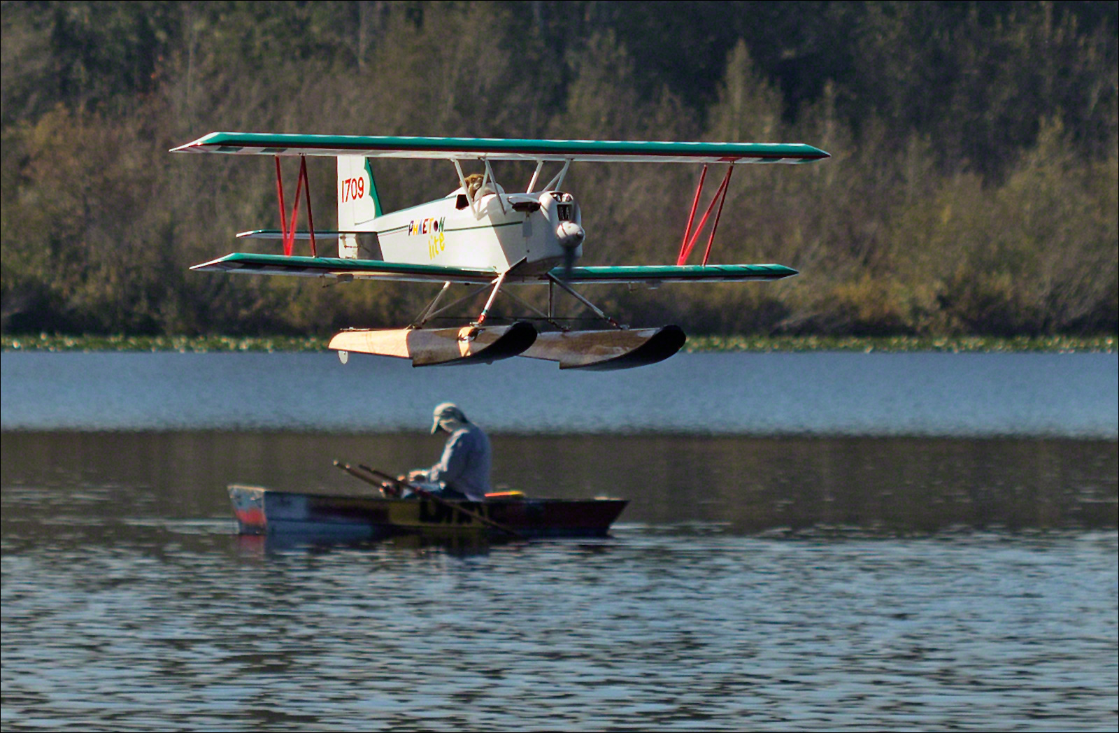
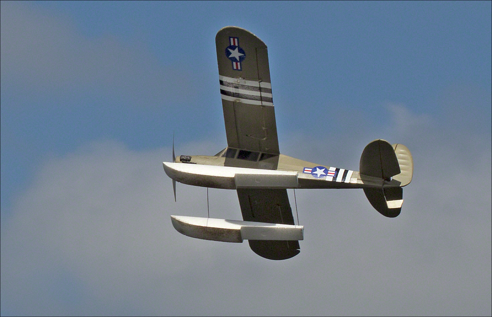
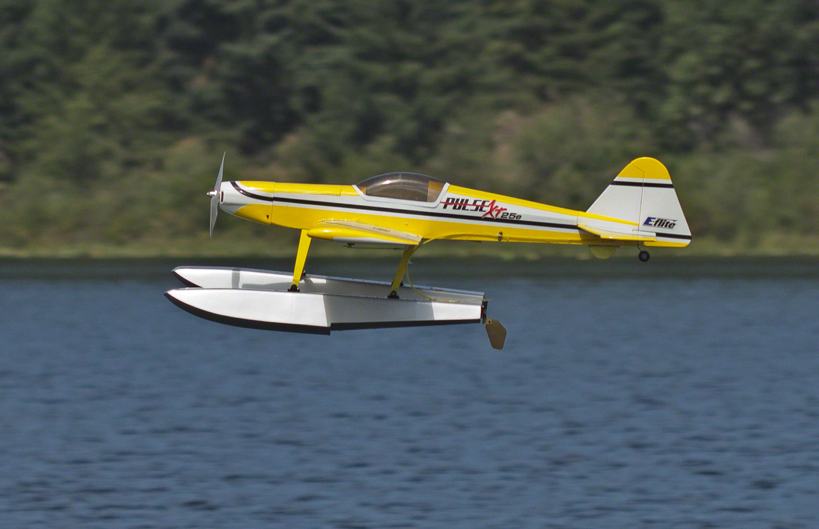
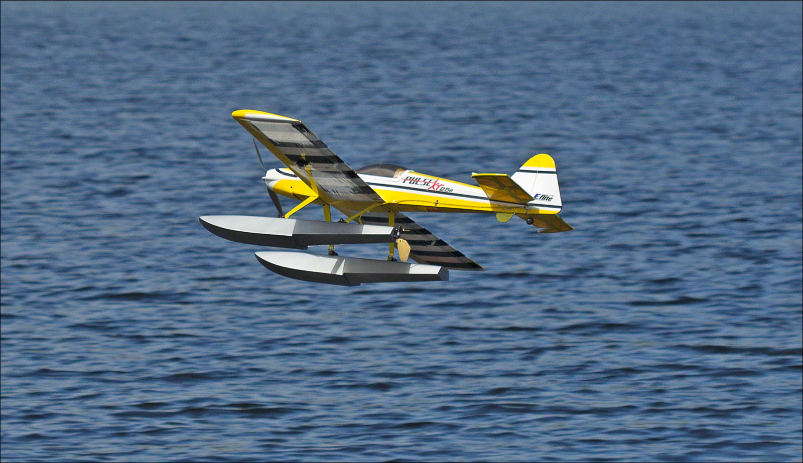
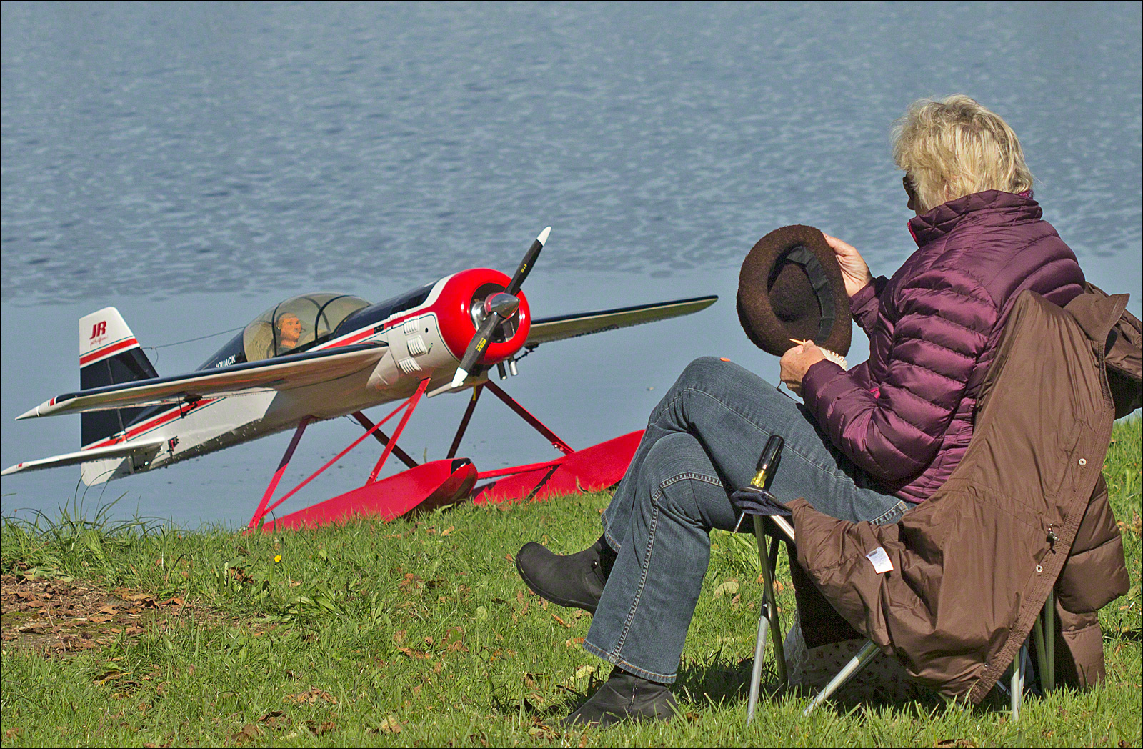
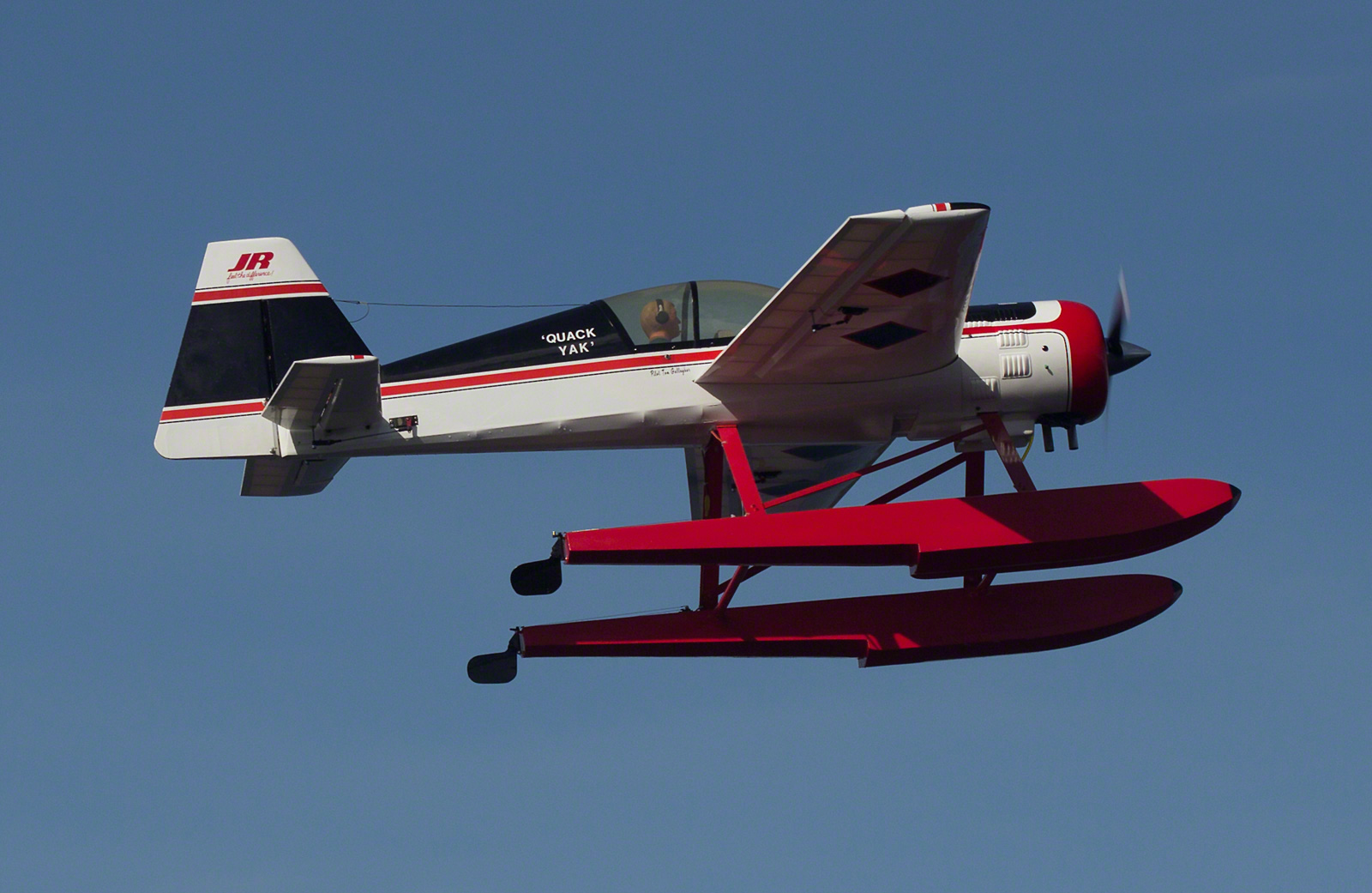

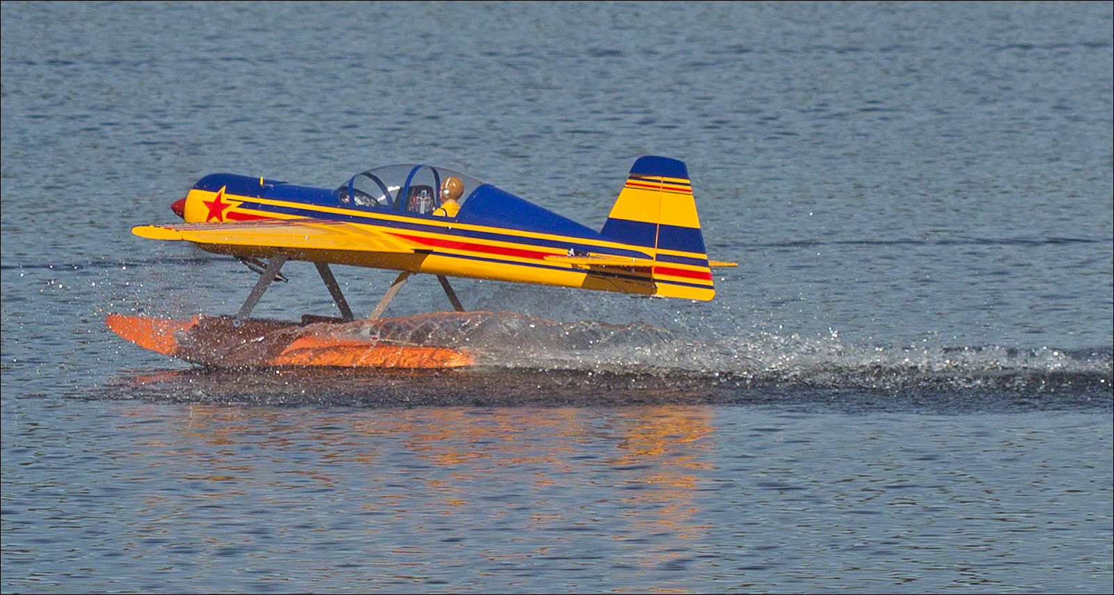
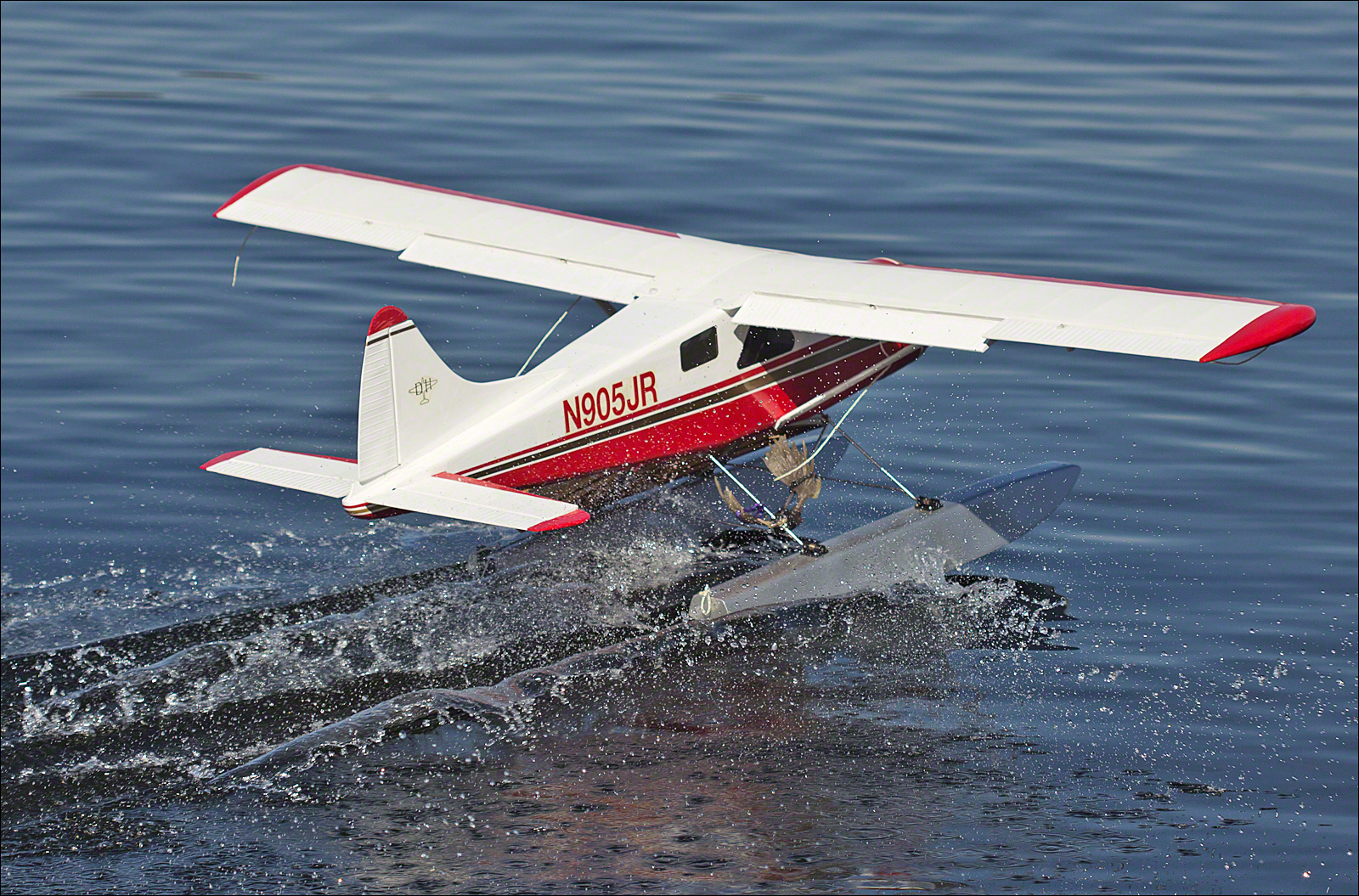
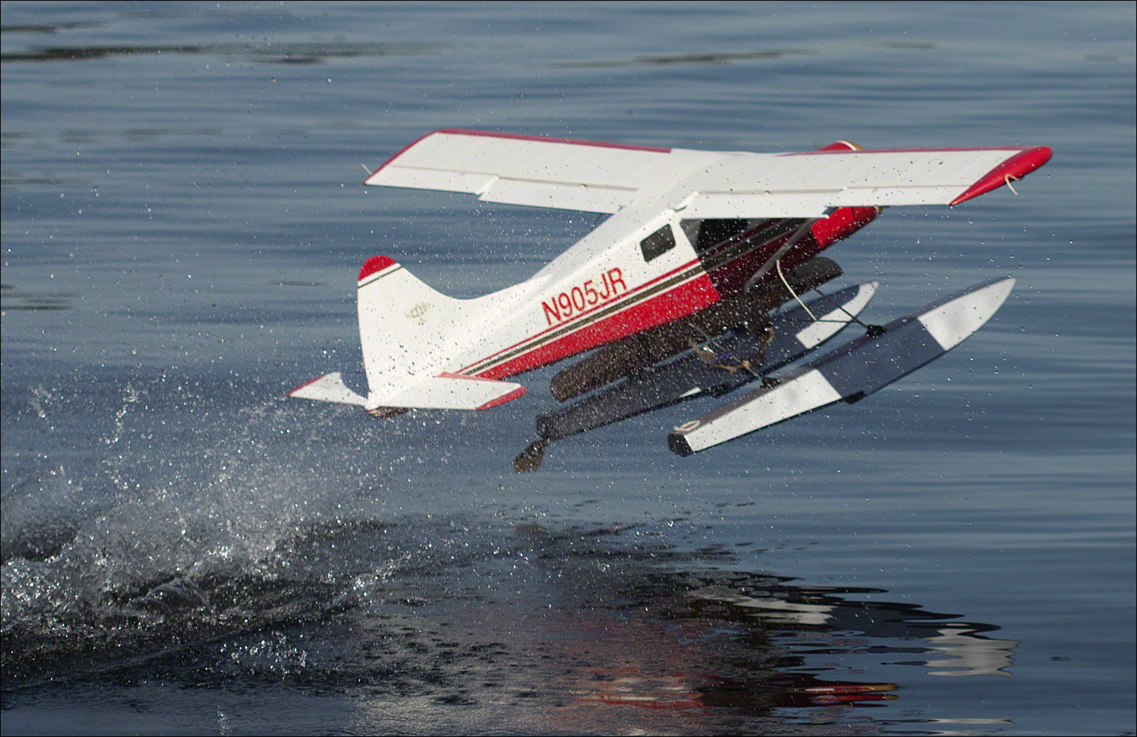
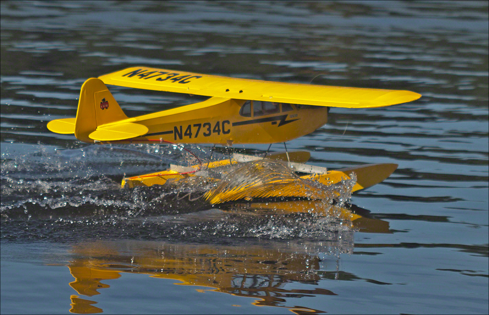
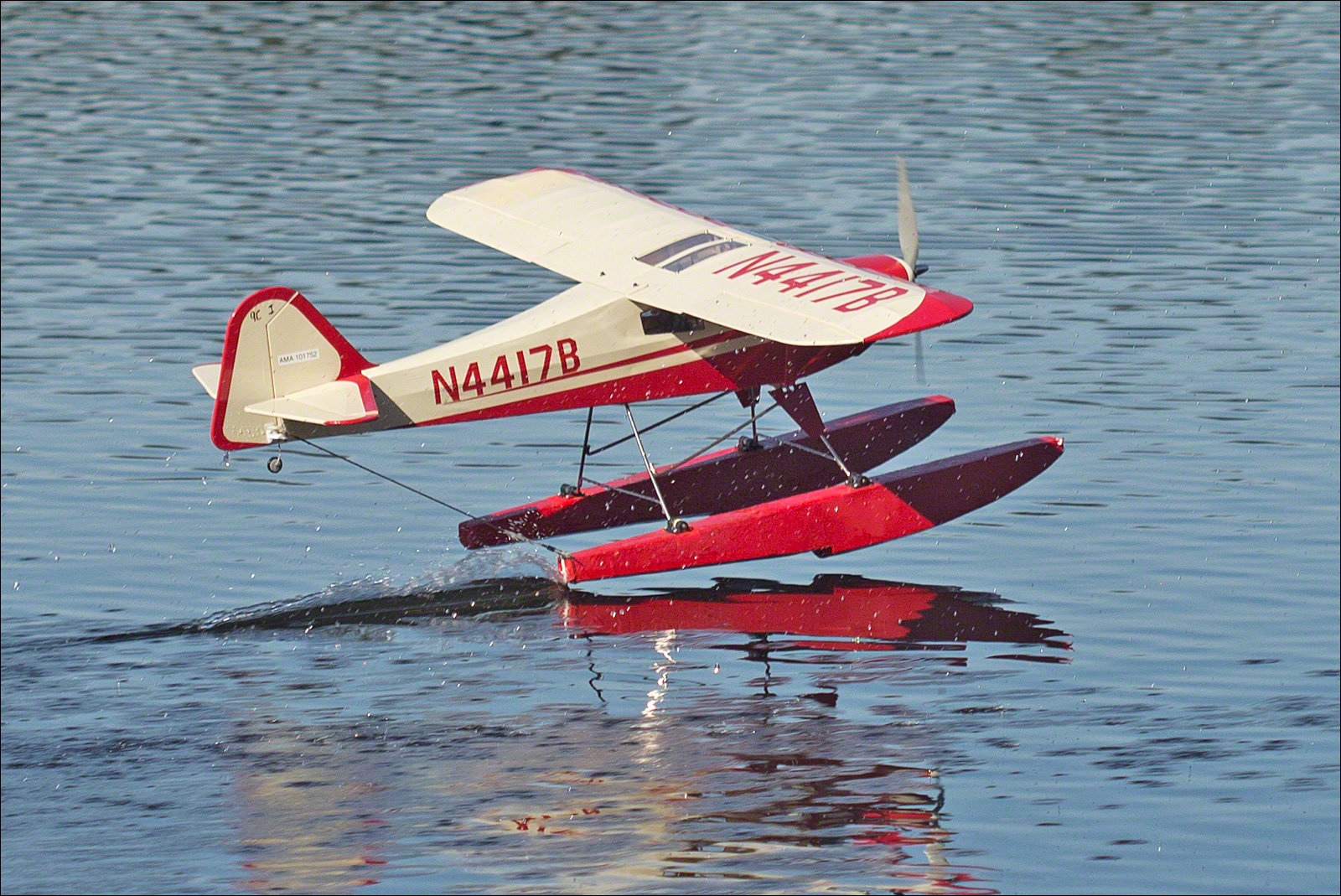
In the Pilot's Chair
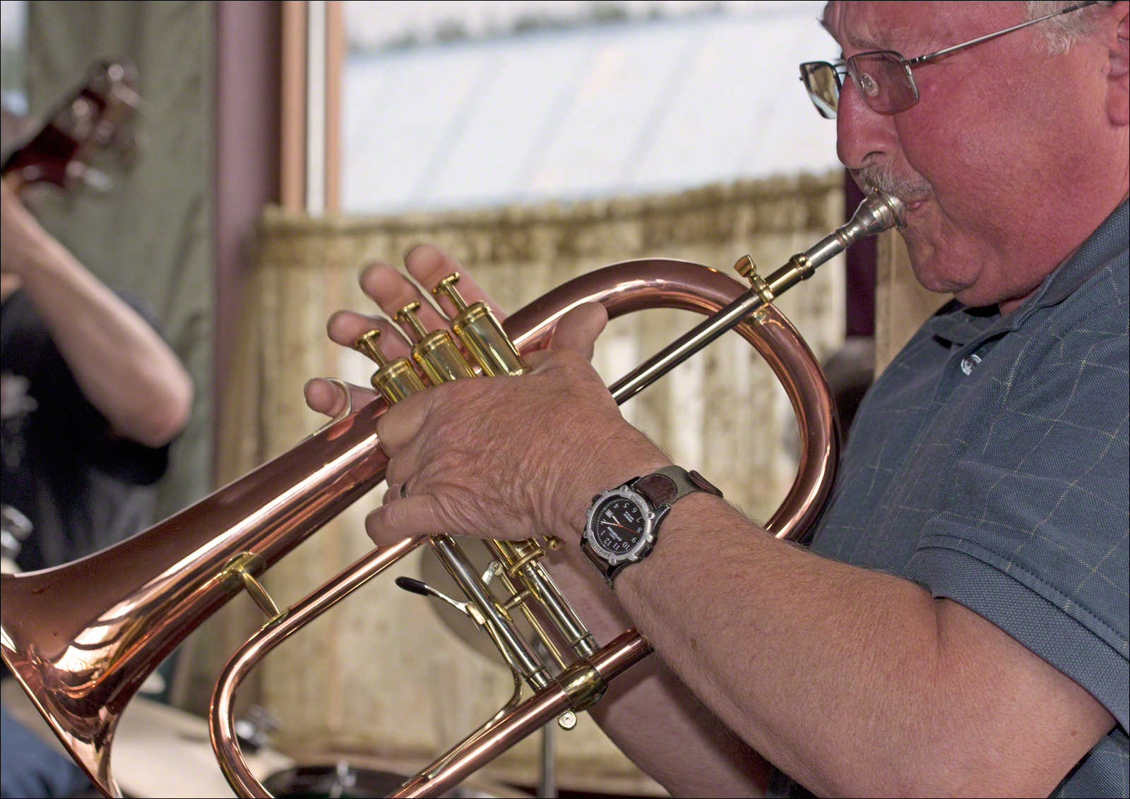
A Little Jazz
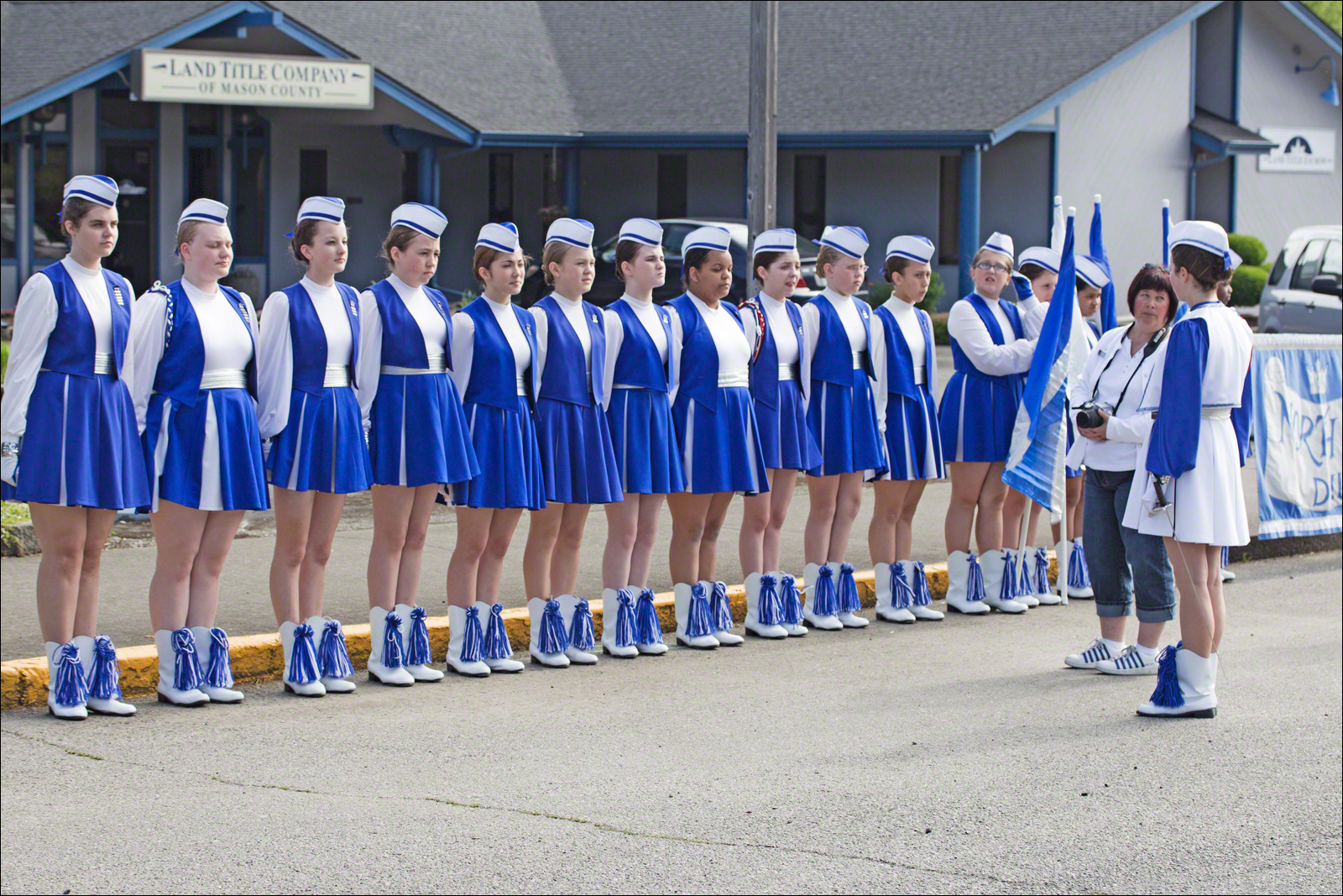
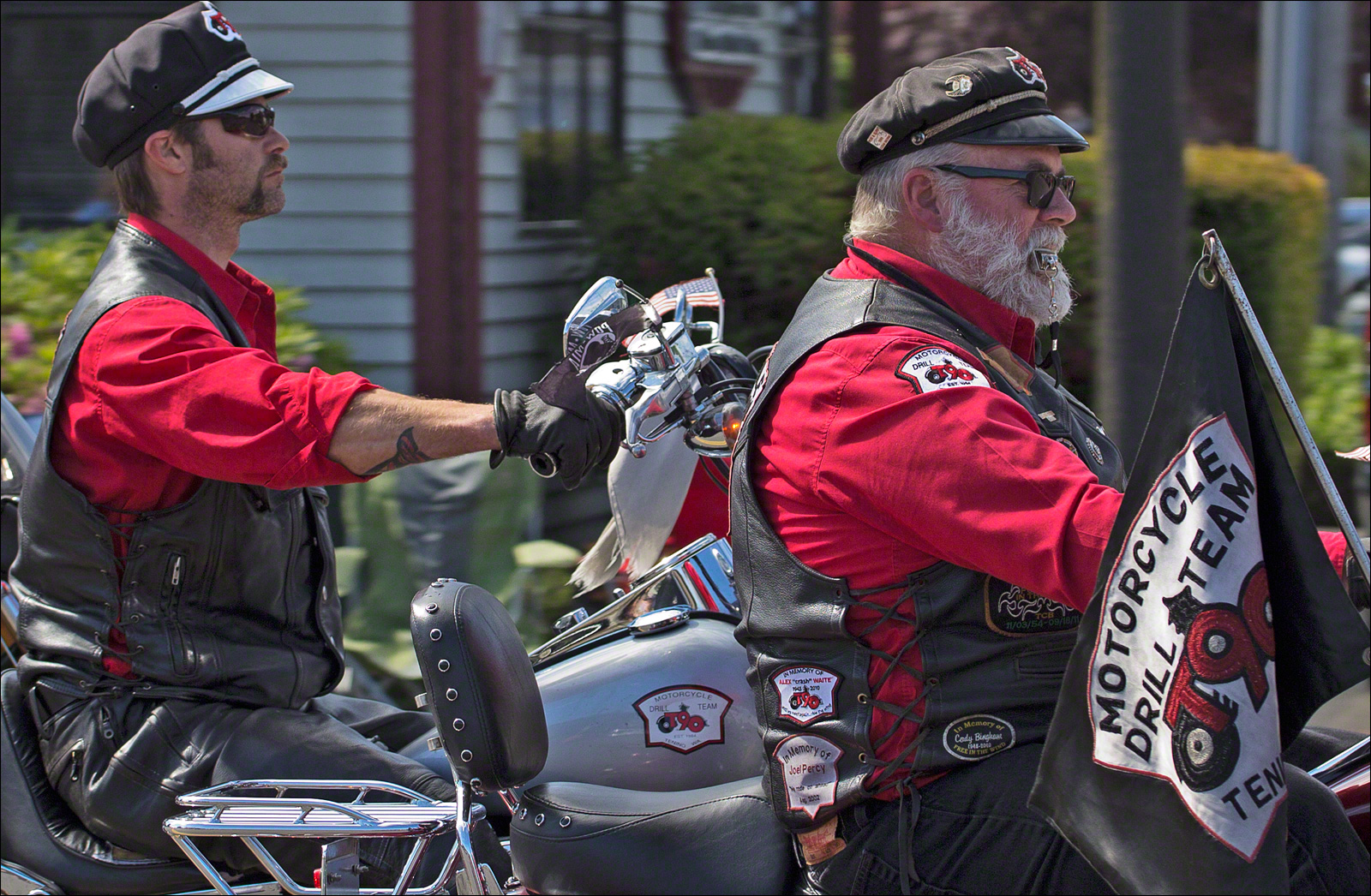
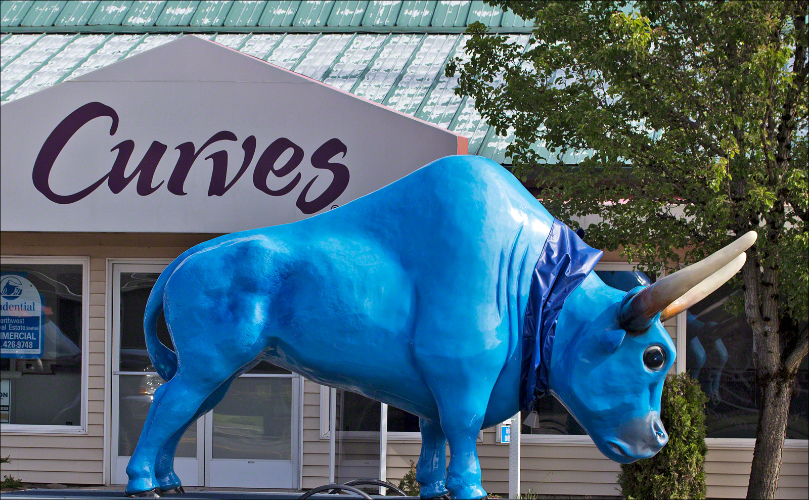
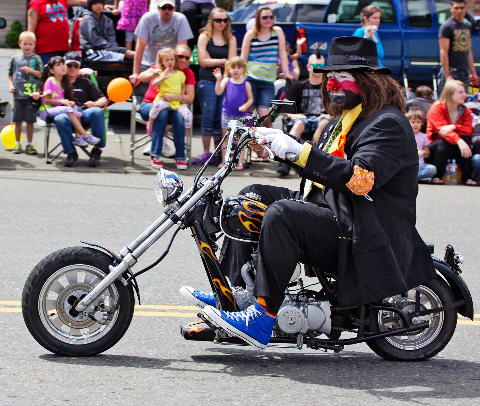
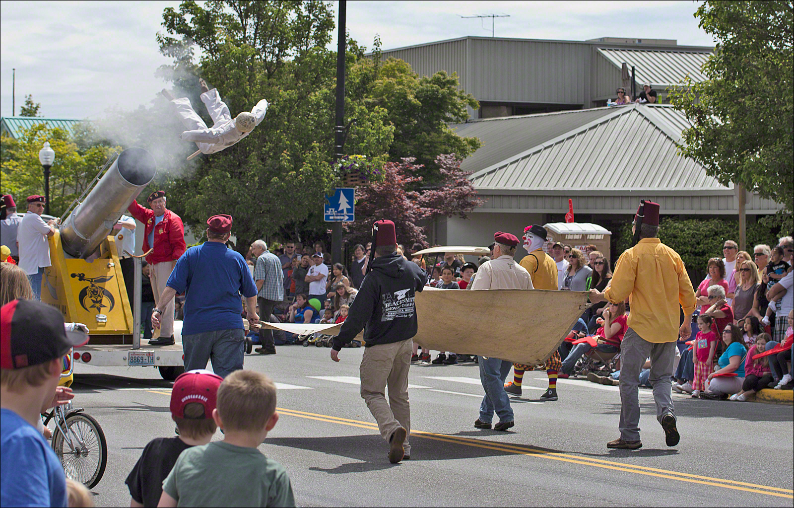
Mason County Forrest Festival
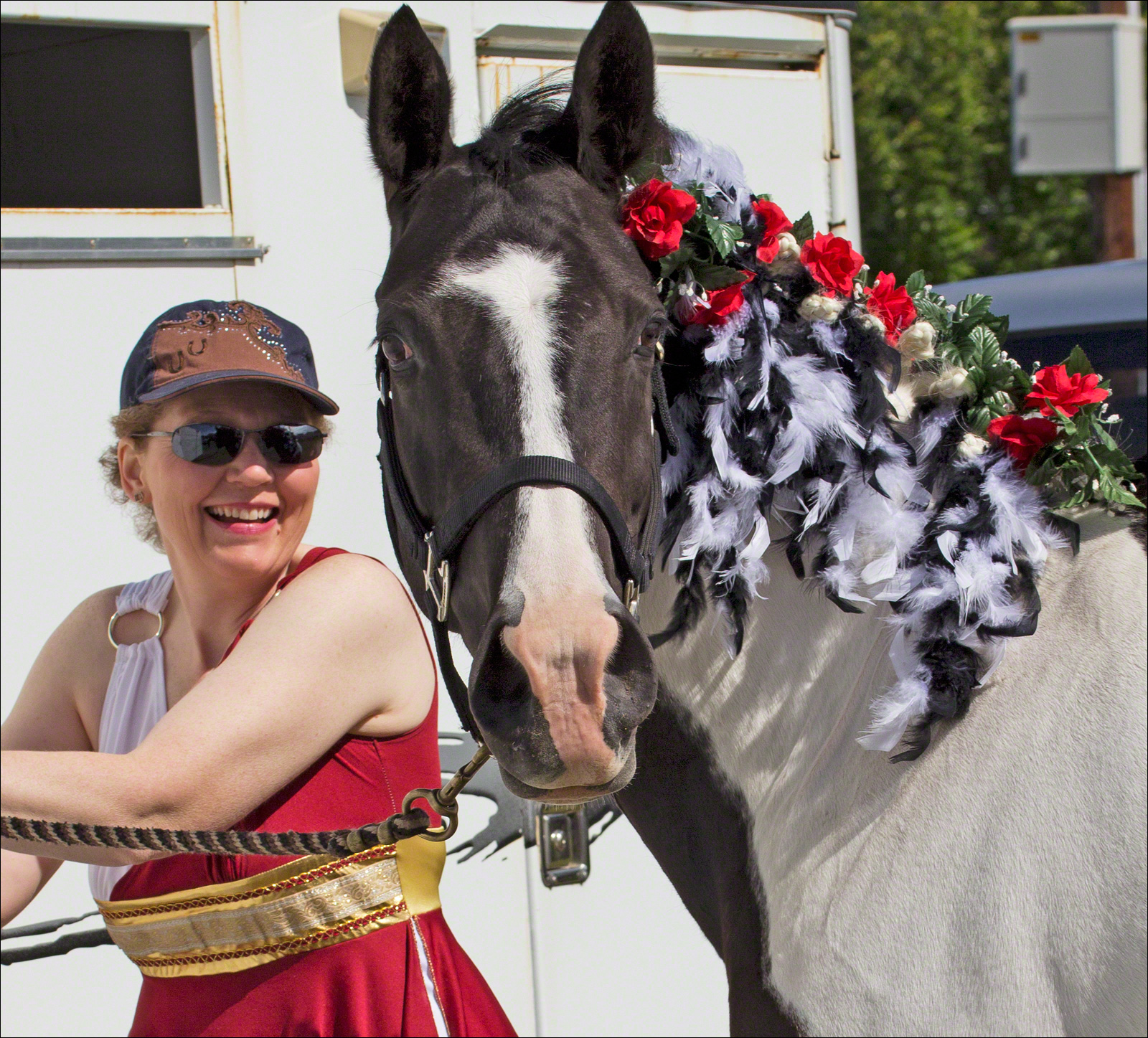
Animal Life
About the Images
The images were taken with a Canon Rebel T3i. I used Canon 60mm and 100mm macro lenses for the images. All images received simple processing in Photoshop and were saved as low-resolution JPEG images that were optimized for the Web.